
CECILIA'S IDENTITY
By Richard Knox

Every performance group needs a visual identity – a public image that announces the group’s style and aspirations. But times change, organizations evolve, and thus Boston Cecilia’s identity has changed radically over its 140-year history.
A tour of those changes reveals a lot about the group’s evolving musical identity and the changing Boston musical culture.
In the beginning, The Cecilia Society (as it was then known) disdained publicity. Marketing and branding weren’t necessary – because the group’s audience wasn’t drawn from the unwashed public.
“In its patrician days among the well-bred of Victorian Boston,” our late colleague Stephen Jay Gould wrote in his centennial history of the organization, “Cecilia never worried about attendance because it sold no tickets to individual concerts and pandered no advertisement of its product.” Its audience was a hand-picked list of sophisticated “associates” – members of a club.
Even so, Cecilia’s privately distributed programs had an elegant look that reflected its elite culture, like this 1893 program cover.

For much of the first half of the 20th century, Cecilia virtually lost its identity. Between 1924 and 1948 it performed virtually nothing under its own banner and was totally subsumed as the chorus of the Boston Symphony Orchestra. That ended when Serge Koussevitsky pronounced the group unfit to sing “with the best orchestra in the world.” Ouch!
In the following years, Cecilia wandered the Valley of Near-Death as it struggled to regain an independent footing. In 1954, a Symphony Hall performance of the Mozart Requiem grossed $891 and cost $3,400 despite, Steve Gould noted, “unprecedented publicity."
Cecilia’s rehabilitation began in the mid-1960s. But it wasn’t until Donald Teeters took up the baton in 1968 that the group began its climb back to flourishing health – musically and, by fits and starts, financially too. However, in the early 1970s the group’s visual identity was strictly utilitarian. Here’s a program cover from 1969.

In 1972, when this writer was a newly minted Cecilian, I was moved to ask Don if I might try my hand at spiffing up the group’s image. Despite my profound lack of credentials, he said, “Sure.” (Besides, we couldn’t afford to hire a pro.)
The first result was this poster for the inaugural concert of the 1973-74 season, a performance of Handel’s Alexander’s Feast.
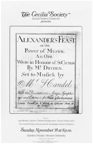
It looks primitive by today’s standards, but it was apparently enough of an improvement that they let me continue designing posters and program covers for some years to come.
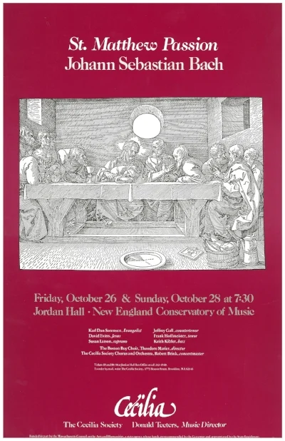
Here’s a gallery of posters and program covers from those years.


This one is from our centennial year of 1976, featuring the then brand-new Hancock Tower, for a program of contemporary Boston music.

Throughout this period the group was still known as The Cecilia Society. But we began to identify ourselves with just the name “Cecilia” – a less quaint and sibilant sobriquet.
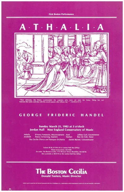
In the early 1980s, Don decided that Cecilia needed to be rebranded with “Boston” in its name, partly because he thought it would work better in recordings. This poster, from 1982, is an early use of The Boston Cecilia name:
Within a couple of years I decided that The Boston Cecilia needed a proper logo – an icon that would define us as a glance in newspaper ads, subscription brochures, concert posters, and of course t-shirts and mugs.

That logo has served Cecilia well over for three decades and more. But lately I began to feel it needed revising, or maybe even replacing. It turned out others were thinking the same thing.
My daughter Sarah is a graduate of the Rhode Island School of Design (RISD ’07) and is now a graphic designer in San Francisco. So of course, I proposed that Sarah help with the logo redesign, and the Powers That Be agreed.
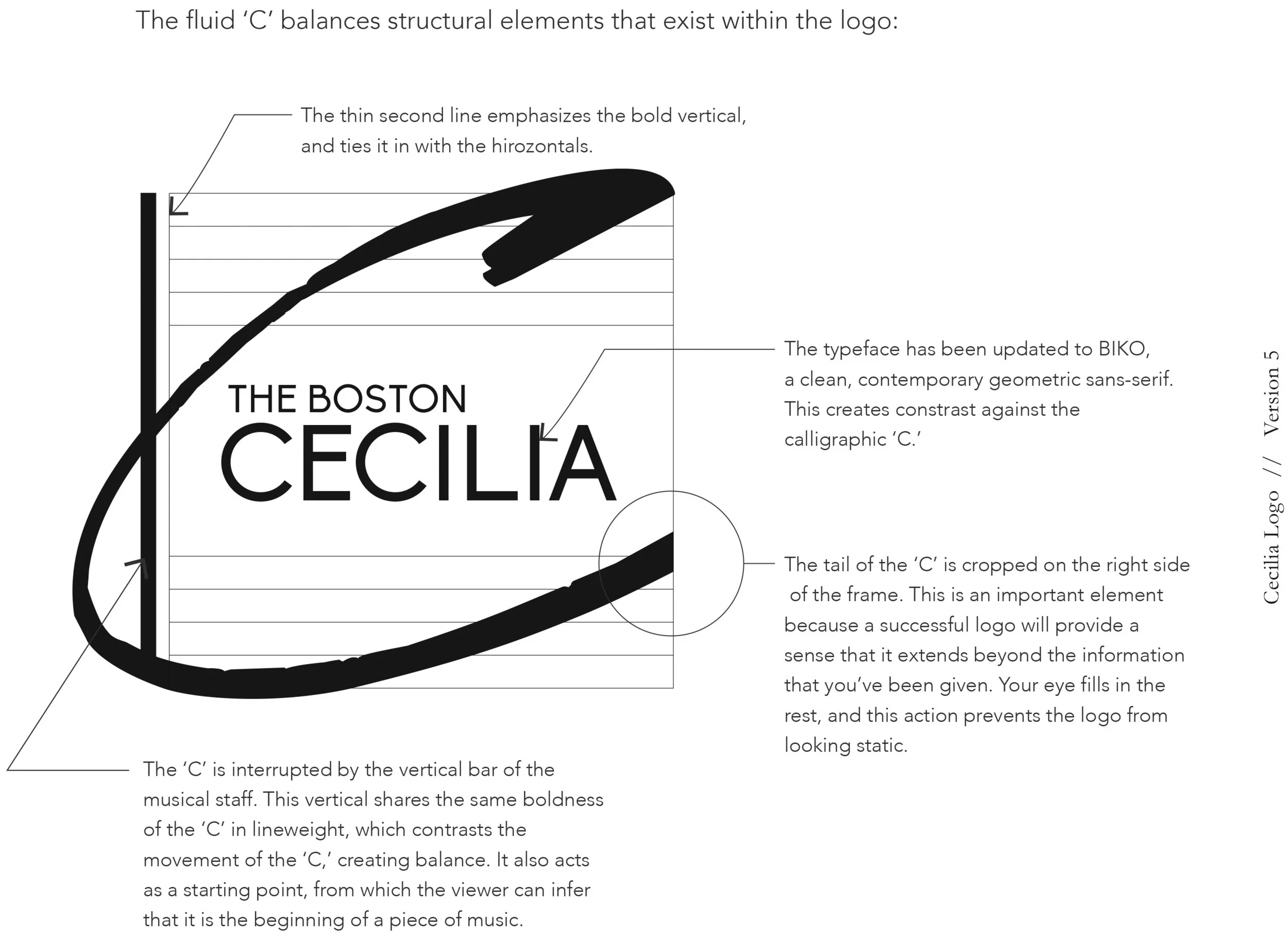
After a number of variations, Sarah came up with this.
And thankfully, the Cecilia board agreed.
It’s not a big departure. We opted for continuity because Cecilia’s identity is heavily invested in the “Big C” design and we didn’t want to throw that away. But the new version is freer and more open – more contemporary and less static than the old logo. And Sarah’s calligraphic “C” is more dynamic – Music Director Nick White immediately thought of a conductor’s gesture. The typeface, called Biko, is fresher.
Nothing is forever. But Sarah and I hope you’ll be associating this new “Big C” logo with the venerable Boston Cecilia for some years to come.